Poster

I wanted my advertisements to all have this retro/50s look to them so i took a lot of inspiration from old Budweiser and beer adverts from the 50s.
The reason behind these style is because i wanted my drink to be looked at as vintage and classic with the slight biker twist of skulls and leather jackets because they all fit within the American 50s theme that i wanted to achieve.
There is plenty synergy throughout my whole entire media campaign and that is drink's Logo or image of the skull with the sunglasses, this is seen on this poster, on the bottle, in the Television advert and on the social media account that was made for the product so that people could link the images together and it will make them remember the product.
MR JACK'S ROOT BEER!
To get the vintage look i used a grainy old photo and tinted it with a yellow overlay so that it would give the poster the old dirty paper style that i was going for. but i also enhanced colors like red and black to make them 'pop out' more so that the key signifiers such as The Mr Jack Biker and logo stood out much more in the poster as they are the real things people will associate and link with my drink.
--------------------------------------------------------------------------------------------------------------------------
Logo

This is the company logo of Mr Jack's Root Beer and as you can see the main colors of red and black are being used to furthermore create the synergy between the different advertisement products for my drink. Also there is another slight similarity between the poster and the logo and that is that the drink is shown in the 'right' hand because we want to subconsciously tell the audience and viewers of the advert that our drink is the 'right' one to drink. Also i realized when making the logo that less is more and i believe that this one is the best looking logo. I wanted my advertisements to be on the fence between classy and hardcore, hence why there is this lovely cursive font over a red Skeleton hand. This could be use of Levi Strauss' binary theory as I've shown the contrast between good and bad throughout my media campaign.
-------------------------------------------------------------------------------------------------------------------------------------------------------------------------------------
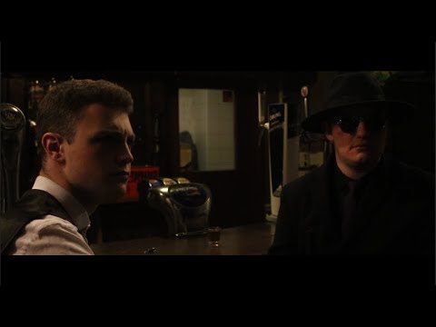
TV advertisement
 |
| Shot 1 |
This is the establishing shot of the advert, it sets the tone the tone for the idea that this campaign is trying to tell an audience which is that our product is better than the competition in the market by showing the contrast between them, hence why the use of black and white is used because it furthermore conotates the idea of the complete differences that mine and other products have. As explained by Levi Strauss' theory of binary opposition i wanted to have this element in my campaigns as it is a very effective way to advertise and broadcast the superiority of a brand and products.
The shot has the whiskey bottle dead center so that it almost gives off the presentation that it this inanimate object is looking at the viewer straight in the eye, making it an easy viewing experience but there is nothing happening in these shot of the 'competition product' which makes this product seem boring and blank. Also the reason i don't have any liquid inside this bottle but do have liquid in my product's bottle is to subconsciously the audience that my product is full of flavour and others don't in comparison.
--------------------------------------------------------------------------------------------------------------------------
 |
| Shot 2 |
This is the next shot and again it sticks to idea of contrasting the presentation of the competition products and my own by using contrast. Contrast doesn't just belong to the colour between the shots but practically with the misc en scene of the two as well. The last shot was firstly in black and white, still image and there was no actions or movement of the sort. Then the jump of the music in the background we cut to this shot and they are completely different as this one is full of colour, dancing and movement which like i say is presenting the fun, crazy and wild lifestyle my drink relates to and presents other drinks as boring and bland.
--------------------------------------------------------------------------------------------------------------------------
 |
| Shot 3 |
I was originally going to have the colour change as the drink was placed down but it looked to unprofessional and choppy so i kept it black and white throughout and kept the sequence looking smooth.
My advert also plays on the needs of peoples acceptance and desire to add fun to their lives, by looking and associating my media campaign to Maslows's hierarchy needs I would say that my campaign relates to people's need of belonging as my product is seen as a social encouragement drink and will bring people closer and form friendships and other relationships so this is a strong marketing strategy as these are more of mental needs for a person.
My advert also plays on the needs of peoples acceptance and desire to add fun to their lives, by looking and associating my media campaign to Maslows's hierarchy needs I would say that my campaign relates to people's need of belonging as my product is seen as a social encouragement drink and will bring people closer and form friendships and other relationships so this is a strong marketing strategy as these are more of mental needs for a person.
--------------------------------------------------------------------------------------------------------------------------
Social Media
Instagram- MrJacksRootBeer
For this Media campaign i chose the social media website Instagram, mainly because i knew the platform was very popular and i knew my way round it myself.
For the profile picture i used the skull of 'Mr Jack' so that people could easily spot the company and it creates synergy through the different forms of media i used in my campaign.

 |
| Diet |
The first photo is of the original bottle cover, i chose to have the original bottle cover as the original look of the bottle so people will be able to easily associate my media campaign to the product through the use of intertextuality and synergy. The second post is of the printed ad so this further more creates the repetition so that my product will become embedded into peoples minds.
The last post furthermore adds to company as it advertises and new version of the drink and this one is diet, this one has a completely different tone compared to the other products.
All my posts had the same hashtag used and that was #mrjacksrootbeer and this creates an online community and it will be able to further create that sense of belonging to the consumer as they can join thousands of other people who also take a liking to the their new favourite drink.
Now one thing i would have done differently is that i would of have put the hashtag and social media links shown on the printed ad and at the end of the TV ad because this would've made it more easy to find for consumers who are interested in this.
I asked 20 people from around the college to look into my media campaign and give me feedback.
For the moving image advert 16/20 said it was excellent and didn't need any improvement but the other 4 said that the message was slightly confusing as in the original didn't put the logo on a the end and they couldn't really understand what product was being advertised so i added the logo and social media accounts at the end.
The poster received great feedback as 19/20 people said they loved it and the vintage look is 'so cool and works with the tone of the company and product' which is exactly what i was going for.
The social media account originally only had 1 post and the majority of the people said that no one will want to follow an account that isn't active so i made sure to add more posts. Once that was done they all said they loved the hashtag and it would be super helpful.


The last post furthermore adds to company as it advertises and new version of the drink and this one is diet, this one has a completely different tone compared to the other products.
 |
| Original |
Notice how they both look similar but are completely different by subtle and explosive changes.
Colour being the main one we notice straight away which i thought was a strong choice as we can now separate and disclose all future diet products as blue and the classic look as the black and white bottle. The reason being the colour of blue was that i know in the media blue is seen as a calm, peaceful and is also considered to represent well being for the mind and soul so it fits the description and idea that i wanted for my diet drink .All my posts had the same hashtag used and that was #mrjacksrootbeer and this creates an online community and it will be able to further create that sense of belonging to the consumer as they can join thousands of other people who also take a liking to the their new favourite drink.
Now one thing i would have done differently is that i would of have put the hashtag and social media links shown on the printed ad and at the end of the TV ad because this would've made it more easy to find for consumers who are interested in this.
Peer Feedback
I asked 20 people from around the college to look into my media campaign and give me feedback.
For the moving image advert 16/20 said it was excellent and didn't need any improvement but the other 4 said that the message was slightly confusing as in the original didn't put the logo on a the end and they couldn't really understand what product was being advertised so i added the logo and social media accounts at the end.
The poster received great feedback as 19/20 people said they loved it and the vintage look is 'so cool and works with the tone of the company and product' which is exactly what i was going for.
The social media account originally only had 1 post and the majority of the people said that no one will want to follow an account that isn't active so i made sure to add more posts. Once that was done they all said they loved the hashtag and it would be super helpful.